If the heart of your brand is the people behind it, the face of your brand is your logo.
Branding influences how your audience — or more importantly, your potential and current customers — thinks of your company and its reputation. Your logo is the cornerstone of your branding and can determine your font, colors, and style.
At SIX Marketing, we recently redesigned our logo after 10 years in business, so I wanted to share a bit of our experience with the process and some helpful tips to consider before getting started. Let's take a look at the strategy behind redesigning logos and how we did it. (I'll also share a free branding template at the bottom of the page.)
How logos reflect brand
How a logo is designed says a lot about a brand (or a lot about what a business wants you to think about their brand,)
A crash-course in semiotics
At the heart of logo design is semiotics, or the study of signs. It's a very complex field of study that's applied to visual arts, language, literature, and more. Its core concept basically boils down to this equation:
sign = signifier (what you see) + signified (what it implies)
Example: According to color theory, navy is the most trustworthy color. A navy logo, then, is a signifier, and trustworthiness is the signified. Together, the two create a sign, or a mental shortcut our brains can take to understand the world around us.
We subconsciously use signs to form opinions about people, companies, objects, and places (and to shape others' opinions about ourselves). We assume that a messy home (the signifier) means that its occupant is unorganized and chaotic (the signified), and that someone with a clean and tidy home (the signifier) has it all under control (the signified). That's the first impression we would have, and it's also why we'd rush to neaten things up if we knew company was coming. Our brains are hardwired to associate characteristics with meanings.
The same goes for your brand. The little details aren't so little — so be aware of each choice you make and what it might imply.
Style matters for first impressions
Popular aesthetic tastes change over time and different design trends come and go. A modern-looking logo with a simple, clean design says something about your company's ability to change or keep up with the times. An outdated logo — while saying that you've been around for a while — can imply that you're being left behind or out of the loop.
Classic-looking logos (that don't look outdated) evoke a feeling that your company's been around for a while and has a certain level of trustworthiness and prestige. Trendy logos, by contrast, make a brand seem young and dynamic.
So theoretically, a century-old business could rebrand with a new, trendy logo to seem young — but they'd probably seem like they're trying too hard. A new brand that's just starting out, however, could adopt a very serious, classic logo, and maybe make itself seem more experienced at first glance.
Leaving your mark on an industry
There a few main types of logo designs, including:
- Wordmarks (the company name spelled out) (this is what SIX's old logo was)
- Lettermarks (the initials of company name)
- Marks (an abstract or pictorial symbol on its own)
- Emblems (words or letters within a shape)
- Combination marks (words or letters next to or intertwined a mark) (this is what SIX's new logo is)
Logos often have an identifying mark that represents their brand. Some logos are so recognizable, however, that companies get rid of their combination mark, dropped their name from their logo all together, and are just identified by their mark — think Apple, Target, Twitter, Mastercard, or Pepsi. A brand might have a nameless logo because they're ubiquitous, but it works both ways — a nameless logo can also imply that a brand's mark is well-known in an industry, even if it's not quite yet.
But marks usually — if not almost always — start out as part of a combination mark or a stylized letter within a wordmark. The arc running through the X in our new logo could be considered a mark, but we're not about to spring a nameless gradient arc on you and expect you to recognize us anytime, anywhere!
7 steps to a successful logo redesign
Step 1: Determine why you need a new logo
There should always be a purpose behind redesigning or refreshing your company’s logo. Brand is something that should be consistent, recognizable, and trustworthy — so it’s understandably not great for business if your logo is constantly shape-shifting. You should have concrete reasons why your logo needs to be revamped.
Reasons should include at least one of the following:
- To reflect company changes or growth (obviously if your name changes, so should your logo)
- To better appeal to your ideal audience
- To keep up with current aesthetics and styles
- To better highlight (or reflect changes to) your mission, business focus, or company culture
- To stand out from the competition
Here's what we did: At SIX, we chose to revamp our logo for several of these reasons. After a decade in business, we had outgrown our old, more simple logo and wanted something that had the potential to convey more meaning and say something about our mission and values.
Step 2: Decide what needs to stay the same
If you lined up all of a company’s past logos side by side, anyone should be able to see a clear evolution between them. Your logo is the face of your business and its makeover shouldn’t wind up making it look like a complete stranger. Current and potential customers should still be able to recognize your brand.
Things you might want to keep the same include:
- Colors
- Marks
- Any other signature elements
Here's what we did: Our old logo was just SIX spelled out in all caps, which was the defining element of our logo. We continue to spell out SIX in our new logo, but added "Marketing" for more context. We also kept our specific shade of blue from our old logo, but added complimentary colors to create a gradient for the arc and to give us more colors to work with on our websites and graphics.
Step 3: Decide what needs to change or be added
Now we get to the real reason you're redesigning your logo — what needs to be improved. Once you've figured out what needs to stay, keep an open mind and be ruthless with the rest.
Things you might want to change or add include:
- Font
- Color
- Style
- Message
- Marks
Here's what we did: We changed our font from serif to sanserif, and embraced a current trend in logo design, disappearing letters. We added a mark (an arc) and the word "Marketing," and colored them with a gradient (another trend) of colors that are analogous (another trend!). Our old logo was very simple, so we created a more dynamic one that could have deeper meaning behind it. Our company name is derived from the six degrees of separation, and we pride ourselves on connecting our clients with the right customers and strategic partners. The arc of our new logo starts from within the word SIX and goes outward, representing that ability to make connections.
Step 4: Bring in your agency & designer
It’s a good idea to have your purpose and your general ideas figured out before handing the project off to your marketing agency and designer, to make sure everyone’s on the same page. But if you’re hitting a wall early on, ask them for help and direction. They should be able to look at your old logo more objectively and might have some clever ideas on how to incorporate your brand’s mission and personality into a new and improved logo.
At this point in the process, your agency and designer should take into consideration your requests, along with your overall business goals and brand strategy. A good designer or agency will make sure that the redesign will benefit your company and align with your goals and brand. If you followed Step 1 and came up with concrete reasons to make changes, you're already on the right path, but your agency and designer should confirm this.
Step 5: Select the right logo as a team
Your agency and designer will create several versions for you to compare and contrast. If your new logo is going to have a deeper meaning, then you need to find the logo that best conveys the culture and mission of the company. Remember what I said at the start of this article:
If the heart of your brand is the people behind it, the face of your brand is your logo.
You need to involve the heart of your brand if you want your logo to accurately represent it. It's important to include at least some, if not all, of your team in the decision-making process, even if you just send out a poll and get everyone's opinion that way. Narrow it down to a few options and ask your people to choose which one they think represents your company the best.
Here's what we did: We narrowed it down to eight designs and sent it out to our entire team to vote and comment on. Then, after we decided on the design, we spent more time tweaking the colors, font, and layout until it was just right.
Step 6: Create multiple versions of your logo
Depending on your logo design, you'll need to request a few different versions from your agency or designer.
Square for social: Our old logo was compact enough that it easily cropped into a square or circle for profile pictures on social media. If your logo is long and thin (like our new one), it will be too small to read at that scale and you'll need to create a more compact version that highlights the most important part of your logo. Be sure to keep in mind that most social channels these days have circular profile images, so make the background large enough that nothing gets cropped.
Mark for icons: If you have a mark in your logo, you'll want to isolate it for use as your favicon (the icon that appears in browser tabs) or as an alternative design for your social profile picture. If you have a wordmark or lettermark logo, you can also use the first letter as your icon.
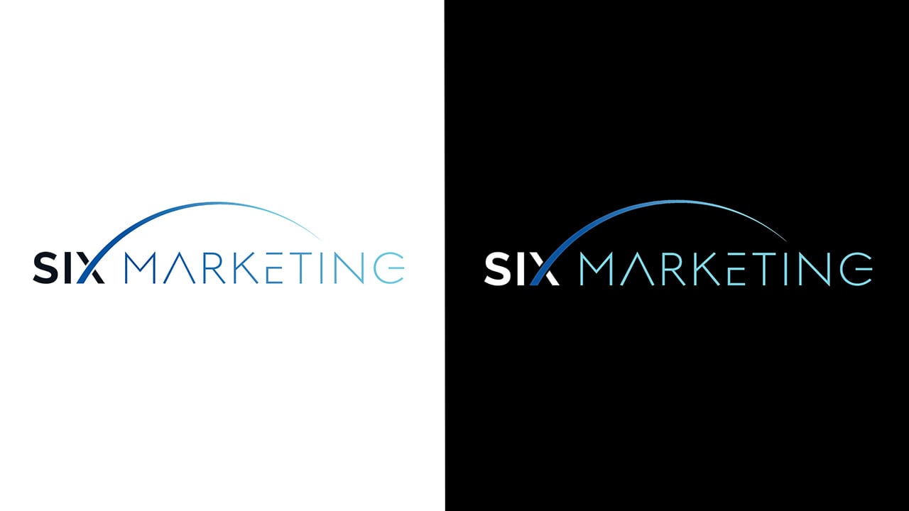
Versions for light/dark backgrounds: Your logo will most commonly be on a white background, but it's important to create a version that stands out against black or other dark colors. In our case, we changed "SIX" from black to white and lightened the gradient for more contrast.
With/without tagline: If your logo includes a tagline, create one version with and one version without it to give yourself more options. A tagline will work in some contexts, but in others it won't.
Step 7: Choose the right time to launch your redesign
Sure, you can launch your new logo on any old day, but there are some occasions that are better than others. If you're hoping to garner attention with your redesign, avoid launching it around holidays or other big events. (If you're trying to sneak the change in under the radar, however, take the opposite approach.)
Some great times to launch a new logo include:
- Company anniversaries
- Website redesigns
- Before you create anything else with your old design
Here's what we did: We decided to update our logo in honor of our 10th year in business, but it also coincided with our ongoing website redesign (almost there!), making it easier to incorporate our logo's new colors. We also held off on producing branded swag or printing new business cards until we nailed down the final design.
The finish line (until your next redesign)
Your brand (and logo) will continue to evolve as your company grows and as styles change, but redesigning your logo shouldn't be taken lightly. Having deliberate reasons for the redesign will instill your new logo with meaning, purpose, and character, and make your brand more memorable and human. Most importantly, your logo should reflect the way you want your current and potential customers to view your company — and it should effectively influence their opinion.
As promised: If you're preparing to redesign your logo or rebrand your company, download our Free Brand Style Guide Template. In it, you'll find guidelines for best practices and a template that's ready to be filled out and used. And for more information and guidance on brand strategy or logo design, you can always book a time to chat with our team.